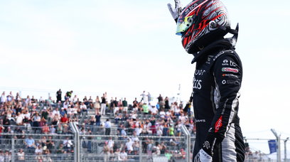
Peter Stevens needs no introduction to supercar fans: He designed the McLaren F1 road car, the facelifted (rounded) Lotus Esprit and its sister the Elan M100. Add in sundry road and rally Subarus, a full range of Rovers, Jaguar's swoopy XJR-15 and the sublime 1999 Le Mans-winning BMW V12 LMR, and it's clear the 78-year-old - who still designs on a daily basis - instinctively understands how to fuse form and function. Lesser known, though, is that as a side-line the now art tutor designed striking liveries for the blue-on-white Bernie Ecclestone Brabhams, did some colourful cars for Benetton and thier predecessor team Toleman and styled (and restyled) various iconic Porsche 962s. The foregoing covers just a fraction of the art professor's automotive back catalogue. When considering a livery, Peter, who races pre-war Ford-based Dry Lakes Hot Rods for fun and distils his own gin, the starting point is: "What is it team and sponsor want to get out of the partnership? A lot of people go into sponsoring cars because of the high profile and the high worth of everything around Formula 1, but it only works if a car exudes that sense of quality and style." As pre-season testing showed, the heavily-revised regulations resulted in new-look cars up and down the grid, and, with F1 riding the crest of a commercial wave, a raft of incoming sponsors - mainly hi-tech and crypto brands - have joined the fray. Thus, the field is set to look totally different from what went before.
Peter Stevens, designer of several legendary cars, in his Ford Hot Rod.
Initial thoughts on the 2022 F1 grid
Who better, then, to pass comment than the good Prof, to boot a true-blue F1 fan who watches every Grand Prix? We supplied a front and side view of every 2022 car shot beautifully by our snapper Michael Potts , then switched on the recorder and let Peter's oft-pithy comments flow as he rated 2022's liveries out of 10 – in descending order. First, though, his first impressions about the actual designs of the cars rather than their only their warpaint. "We had seen those [mock-up] images which Liberty Media had a product designer work on, and the cars looked kind of good, the rear wings were cool and the sidepods were sort of slim," Peter opens. "They were quite nicely modelled because they had a product design guide when they were doing the aero development. I think, our expectations were really quite high that these cars were going to look quite cool. To a degree, I was disappointed when I saw the cars during that first three-day test in Barcelona. "I was particularly disappointed with how the sidepods looked on the Mercedes; there was just awful surfacing, and I couldn't understand why – it was like three puppies fighting in a silver sack! "Some of the others don't have very good surfacing, either. At that point, the task of the graphic designer is to make the car look attractive despite the form, because what you're trying to do is sell stuff that's advertised on the side of the car. If the thing looks ugly, I think it's counterproductive to what you're trying to do by having sponsorship."
Alfa Romeo: 9
"I'll start by saying the way the Alfa Romeo looks, [it] doesn't emphasise the pregnant look of the sidepods; it does the opposite, and it's really strong. "Your eye is drawn to the strength of the [serpent] graphic rather than some weird (surface) modelling that there is on [some] cars. For me, it stood out immediately amongst the liveries – although we didn't see it until after the test. The camouflage was an interesting thing to do; it looked fun. Having done camouflage schemes for road cars [I know how much] of the detail you can hide. "What I noticed in the pictures is how nicely the metallic red picks up light. It actually makes the shapes look even better, but I don't know why it's got a funny little white patch at the end of the nose; maybe to have somewhere to stick the Alfa badge..."
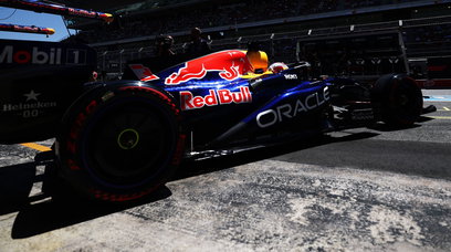
Red Bull: 8+
"Red Bull are always so professional. The superficial thing to say is 'It looks like last year's', but it doesn't. The distribution of the yellow and the amount of red or the size of the bull seems to be tuned to suit a particular car. "The way the yellow is used around the air intake - with the bulls either side - works really well. There's no doubt on TV that it's a Red Bull, and if you're looking at [F1] on a small device the message is very strongly there. On the pages of magazines, it looks extremely good. "The blue seems darker than last year and blends well with the black, so you don't see the raggedy underside where all the technology is. It's not particularly attractive, but it doesn't show up, which is nice – and, of course, that's where all the development will be… "The only reason it's [not rated higher] is it's a bit predictable; there should have been something that makes you say, 'Wow, that's clever.'"
AlphaTauri: 8-
"Last year I favoured the AlphaTauri, but this year they've gone more traditional. The way the livery follows the curve of the sidepod goes away from the strength of what they did before – last year it said 'f**k you' to the shape of the car… "The big kind of A-ball lettering on the engine cover is great and I like the way the colour comes down the nose; really nicely controlled, that dark blue. They've done well with the way they managed to get the lettering on the front wing – it's usually a nightmare, that. And, 'Fashion meets function' – that's good. "It looks fresh, and it looks good. I looked at [all the liveries] on the iPad. I don't look at anything like that on a phone, but I think most young people do. So, you need to have something strong and there's no doubt simple dark blue and white, like simple red and white, is understandable on a phone."
McLaren: 7
"The McLaren looks good on TV; it does its job very well. They've avoided the droopy line with that crisp line on the sidepod which disguises what the shape is there. "My daughter [watching TV] immediately picked up on the DeWalt sticker while the car was stationary in the pits lane, and said, 'Dad, those are the tools you use', so the logo seems to do the job stuck down there, but then they've got the tiniest Gulf stickers… "They've done that classic old race team thing with that black bit that comes back from the cockpit with a funny droop in it, which I particularly like. When I first saw that pale blue, I thought 'That's a bit weedy'… but actually it complements the orange and doesn't fight with it. It all actually works rather well."
Williams: 7
"Williams is a disappointment because last year it was such a great-looking car. They don't have a [main] sponsor and the livery could well change, but the blues aren't a contrast as they were last year. Pity – that drops the Williams a bit. "Overall, it's a bit dull [without logos] but the main colour is still quite strong."
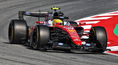
Ferrari: 6
"Thank goodness that horrible dipped-in-brown-soup at the back [from 2021] has gone; the way it morphed into that brown was quite sad. I don't know how that satin finish - it looks like a wrap - will look in the bright sun – it's pretty dark. "I'm fascinated by the sidepods and how air comes out of that scoop; it's very interesting. The modelling around the intakes and radiators is very nicely done – I wonder whether they're using different CAD programmes from other teams… or Rory Byrne, he's got a good eye for what air wants to do … "The line along the top of the sidepods: it's got that little curve at the back then follows that line down the nose: that's super, [which means] they don't need to fiddle about with colours. "I'd put the Ray-Ban [sticker] ahead of CEVA because Ray-Ban is squeezed for space and CEVA has almost too much. It would be more arresting and make more sense because Shell is the big [logo], then Ray-Ban, then CEVA. It's a kind of picky designer thing – but because the car flows well, so should the graphics. "Celebrating 75 years of Ferrari, that's cool, then the Italian flag – the detail is good."
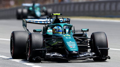
Aston Martin: 5
"They settled on the Aston green which is fine, but for me there's a bit too much white. The graphics are nicely put on - Aramco, Cognizant and a bit of Peroni - which isn't ever a bad thing. It's funny, because it's quite simple, but causes me to look at the people who support them. "The JCB though looks like a sticker, the others don't look like stickers …overall the car's okay; it's tidy but has a sort of droopiness – at which point your task is to make the car not look heavy. "They like that lime green, [but] under the sidepod the line makes it look curiously [bloated]. The outlets on the top of the sidepods, they're done by CAD - click, click, click - and the angle could have been slightly changed to give a bit of speed. That wouldn't have affected how air comes out, regardless of what anyone says. That frustrates me, as it does with similar projects."
Haas: 4
"I downloaded high-quality images showing the car with and without Russian colours on it. That flick of the Russian colours at the back is nice from a design point of view, but what's interesting is that it's obviously a sticker that includes the driver number because that disappeared when they stripped off the Uralkali stuff! "The colours also enhance the fatness of the sidepods, but not as badly [as others]. I've given them a four based on what I'd seen, but of course we don't know what they'll come up with in future [with another sponsor]."
Mercedes: 3-
"Having changed the colour from black back to silver, I preferred the black. Maybe they should have added a little silver to a basically black scheme; silver shows both the best and the worst in a form. "Looking at the side view, as I said, like 'puppies fighting in a silver sack'. The car seems a bit clunky, their DRS trunking to the rear wing is clumsy as well. If the thing were matt black, you wouldn't see all that, but the trouble is, if I'm looking at that, I'm not [looking at the commercial messages]. "That Ineos sticker up there – it doesn't relate to anything, it doesn't excite me. It's funny, because down the nose [the line] is actually nice; it's almost like different people worked on different bits of the car: a nose team, a centre section team and a rear wing team…"
Alpine: 2+
"I looked on Alpine enthusiasts' websites and there was nothing but enormous criticism [about the pink] – just raging [smileys] screaming, 'Alpine is blue!' "The basic shape of the car is actually quite pleasing, but you can't miss that it's got BWT on it from any direction you look at it. [Fans] weren't happy with the BWT pink - it's a horrible pink - and I wonder why they didn't reverse it and have pink lettering on dark blue [rather than blue on pink]. The whole point of Alpine is it's Frenchness, and last year's [ tricolore ] livery was great; the car looked good. "If your heroically enthusiastic band of supporters hate it - and there wasn't a single person who said, 'It's great', then that's a shame, because it defeats the purpose of what you're trying to do. "It seems almost as though it was at the whim of some marketing type, because marketing people are remarkably good at deluding themselves into thinking how important it is what they do..."
Most read


Never miss a thing from the Formula 1 season! Add the 2026 F1 schedule to your calendar at the touch of a button. Subscribe below and put the dates and times of every race directly on your PC or smartphone, so you don't miss a second from the new season.
Download the F1 calendar Download the F1 calendar
A variant with just the race and qualifying is also available.
Click here to download it..