F1 75 Live went down to much fanfare, with the ambitious undertaking exceeding expectations and generally being met by positive reviews - from both those in attendance and those watching at home. The liveries, on the other hand, maybe did not quite hit the mark for some. Red Bull appear to have changed nothing at all, whilst constructors' champions McLaren has only made minor alterations - likewise with Mercedes. Ferrari has seemingly merged with a tribute band for late 90s/noughties rock duo The White Stripes , and only one team truly defied expectations with its livery. Who has the best livery on the F1 grid is a great, and ultimately entirely inconsequential, debate. The old idiom "if it looks fast, it'll go fast" does not always stack up. Whoever came up with that evidently never came across the Jaguar or Arrows teams from the early 2000s, so in the grand scheme of things, it does not translate one bit to how things will shake out on track - but it is fun nonetheless. So, with that, let us rank the 2025 F1 liveries from worst to best.
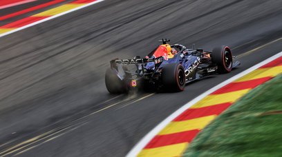
10. Red Bull - 5/10
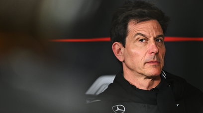
Sure, if it ain't broke, don't fix it. But we are now a decade into this Red Bull livery. Yes, iconic looks are not developed overnight, and down the line we will all reflect on this livery with great fondness, but would it hurt the Milton Keynes squad to freshen things up just a little? Christian Horner loves to discuss "diminishing returns" and that aptly summarises Red Bull's approach to its livery. It has become so predictable that the team loses marks. It is a fundamentally good look, but it badly needs a new lease of life. Will its technical partnership with Ford from next season provide that? Maybe. But when even your star driver is crying out for change, perhaps it is time to take your car to a mirror and give it a long, hard look in it.
9. Stake - 6/10
In many ways, a significant upgrade on the first Stake livery, but the previous green probably would have worked better than this new, slightly watered-down colour. The two-tone approach between front and back works well, as does the differently-coloured wheel covers (aside from the tacky casino chip finish on the front set). That brings me onto the overarching point and a considerable bone of contention - and why it does not score highly: The Stake logo is dreadful and gambling sponsorship is the next through-regulation bubble to burst in F1, like with tobacco. Let's hope it doesn't find a clever way to reinvent itself like alcohol-free products have.
8. Mercedes - 6/10
Basically feels like a worse version of last year's livery, doesn't it? The Ineos airbox was hated at the time. Funny how you miss things you never liked. Plus, it almost feels like that part of the livery was changed last minute due to unforeseen circumstances. (Wink, wink. Nudge, nudge.) Truth be told, I am a fan of this livery, but it suffers from Red Bull-itis in the sense that teams need to move the needle forward with their liveries, otherwise you end up swallowed by the competition, despite the car actually looking quite nice. Overall, the Ineos change is jarring and gives it a not-quite-finished look. Just thank goodness Mercedes has fixed the teal stripe underneath the Petronas logo that it added mid-way through last year. That small alteration has significantly improved the flow and feel of the livery.
7. Haas - 6.5/10
Haas went and flip-reversed it and I have a funny feeling this livery will grow on me. This might sound weird, but it does feel more like an IndyCar look than an F1 paint job to me. The renders do not really do it justice, either. Despite the previous point, there is some nice subtlety to it, particularly with the accents, which is something to mention given how bold and brash white, black and red is as far as colour schemes go. However, it was far more impressive when displayed during F1 75. I guess we will simply have to wait and see how it looks on track (in an official capacity, of course).
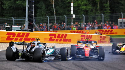
6. Ferrari - 6.5/10
Another livery I sense will grow on me as the season progresses, except I'm not sure I want this one to, like a rash - or in this case an infected tattoo, no doubt down to the use of HP ink. So much of the livery is well executed, but the American technology (printer) company must pay for the crimes it has committed to the Italian team and its liveries. I know I'm flogging a dead (prancing) horse with this one, but why can't a whited-out HP logo be used instead? To conclude the rant, I will move from one ill-considered sponsor to another. The UniCredit logo massively cheapens the overall look and feel of the car. Oh the pain.
5. Aston Martin - 7/10
Another fundamentally strong livery. The F1 grid is lessened by not having a green car on it. Aston Martin has thankfully filled that gaping void. However, like with Red Bull - and to a smaller extent Mercedes - if you are not moving forwards, you are moving backwards. Then there is a compound effect of incremental changes, like the black Aramco sidepod or the white Maaden airbox, worsening the overall feng shui of the piece.
4. McLaren - 7.5/10
It is like the top five teams all clubbed together and agreed to not really try when it comes to their 2025 liveries. That cartel aside, the McLaren was my favourite car last year, but again, has failed to move the chains forward in any meaningful way this term. Yes, the finish is no longer matte, but there is not enough to shout - or even write home in a carefully-penned letter - about. Then you have the new flash of a lighter, more turquoise blue around the front of the cockpit that massively clashes with the already-jarring DP World navy. I will admit though, the Mastercard logo on the front wing does add something for me, strangely.
3. Alpine - 8/10
There is always one selection on this list that upsets people, and this will no doubt be it. I really liked the Alpine livery last season and I have not changed my opinion. I perhaps love it a little less than I did 12 months ago, despite it being an objective step forward, but the game is relative. The more prominent, and deeper, blue is a good thing and less exposed carbon is surely something to cheer about, no? Either way, I have no hope of convincing people. But to me, it just works. The pink nose and majority blue should look worse than it does, so props to Alpine for executing what is not an easy task.
2. Williams - 8.5/10
I, like many, did not see this shade of blue coming. Turns out, that is what new title sponsor Atlassian's blue looks like - and it works. The darker nose heading into the lighter, brighter blue gives the car a strong flow to it and the white detailing brings it together with added shape and contrast. Williams has just done a really good job with this. There is not much more to say than that. The team is one head of the trident that will make for a truly beautiful midfield trio this year with Alpine and...
1. Racing Bulls - 9.5/10
Exquisite. Magnificent. I love it. Just, yes . If only there was some way to make a smaller version that you could buy and keep in your home. Oh wait... My future purchases aside, a striking white livery is imperative for F1 and the Racing Bulls car fills a gap in the market that Haas never truly did. I don't need to overly wax lyrical on this one, because I'm sure we are all in agreement here. But it is important to note that this would have been a 10/10, but for the tiny, well... racing bulls at the back of the car. I get why it has been done, obviously, but it just does not quite work - it looks a bit silly. One for the kids, you might say. However, the underlying point here is that since 2021 almost everyone has been calling for a return of the white Red Bull and now it has finally arrived. It is just a shame the Milton Keynes squad used up all its creativity on this fine, fine machine, leaving none for its main team. Which 2025 F1 livery is your favourite? Let us know what you think below in the latest poll by RacingNews365 and by leaving a comment.
Most read
Never miss a thing from the Formula 1 season! Add the 2026 F1 schedule to your calendar at the touch of a button. Subscribe below and put the dates and times of every race directly on your PC or smartphone, so you don't miss a second from the new season.
Download the F1 calendar Download the F1 calendar
A variant with just the race and qualifying is also available.
Click here to download it..